How do I use “Blend Mode”

Many photo post-processing editors feature “layers”, several images at the same time. Here we use Corel PaintShop Pro to illustrate layers and a couple blend modes.

Blend modes allow combining layers in different ways.

After you open an image you can make additional layers. Show the Layers Palette. Right-click the little image in the sidebar and duplicate it a couple of times. The sidebar has several columns as you can see in my illustration here.
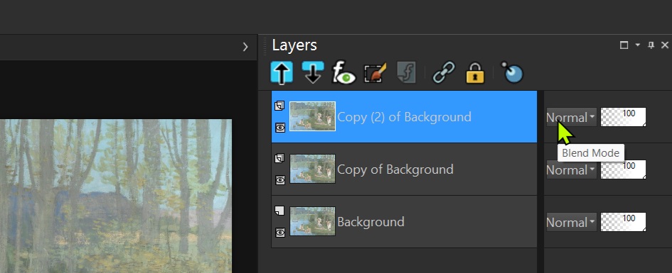
In the Layers pane there is a little image of each layer. Next to the right is the “Blend Mode”. The default is “Normal”. Click on that and you will see a listing of the various modes.
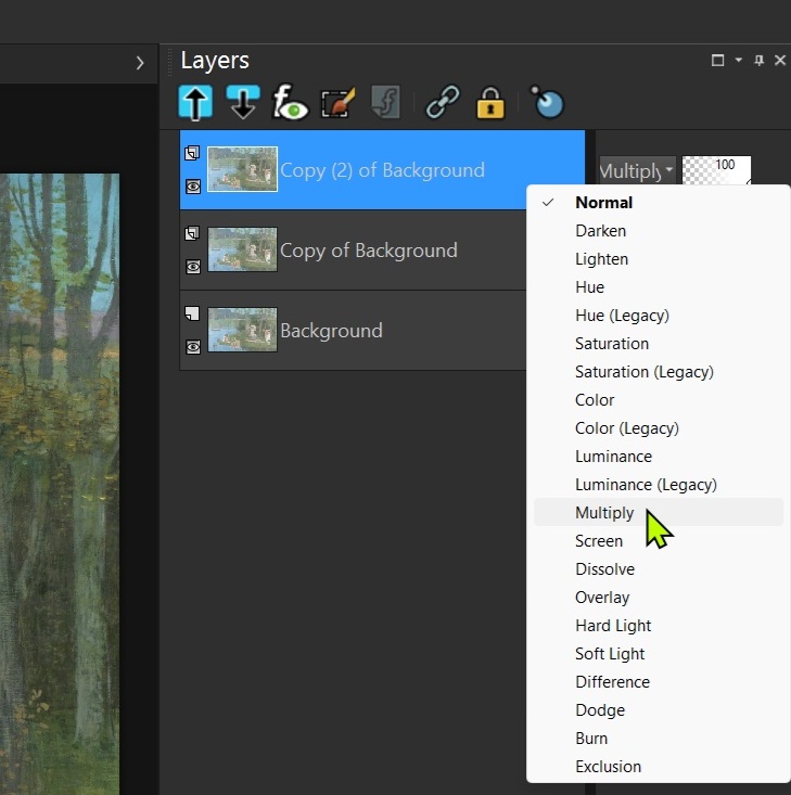
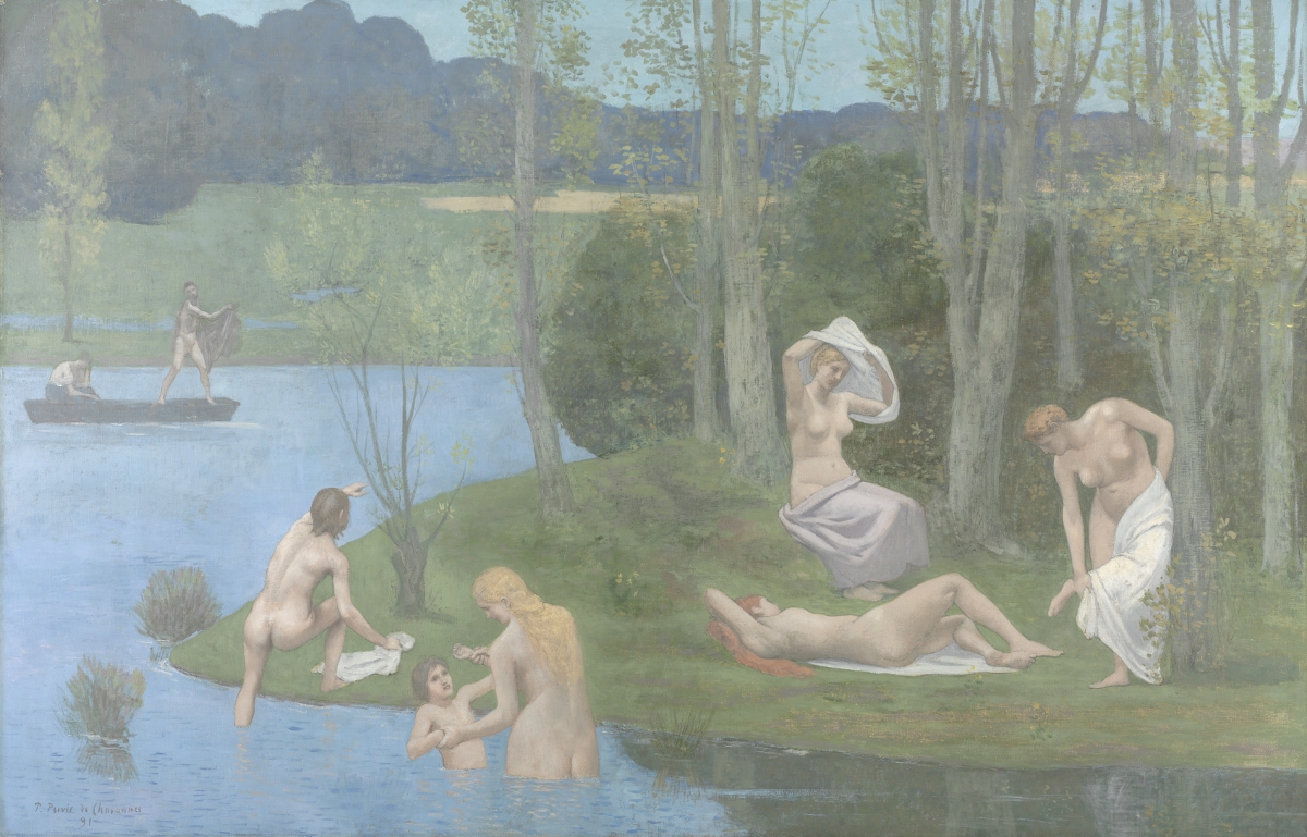
Here I will describe the use of just two of the, Multiply and Screen. As an illustration I will use an image of a painting from the Cleveland Museum of Art that is very faded and “washed out”.
Next I multiply two layers of this image with each other. Think of the pixel values as going from zero to one for black to white. When a value of 0.4, a gray area, is multiplied with itself (i.e. 0.4 x 0.4) we get 0.16 a much lower value and much closer to black (zero), a much darker gray. Multiplying 0.8, a fairly light value, with itself gives 0.64 again a darker gray. All of the results stay within the zero to one range. Thus we don’t burn any highlights nor cut of any pixels on the black end.

What we do get is a darker image with higher contrast.
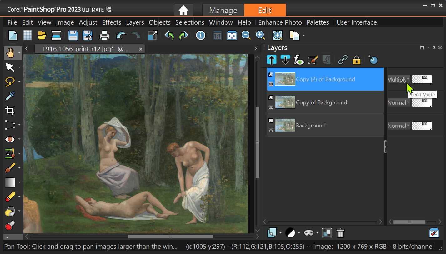
SC-PSP-blend-mode

Right-clicking in the blue area gives options including merging the layer with the next lower one. I did that, duplicated the layer again and multiplied the layers one more.
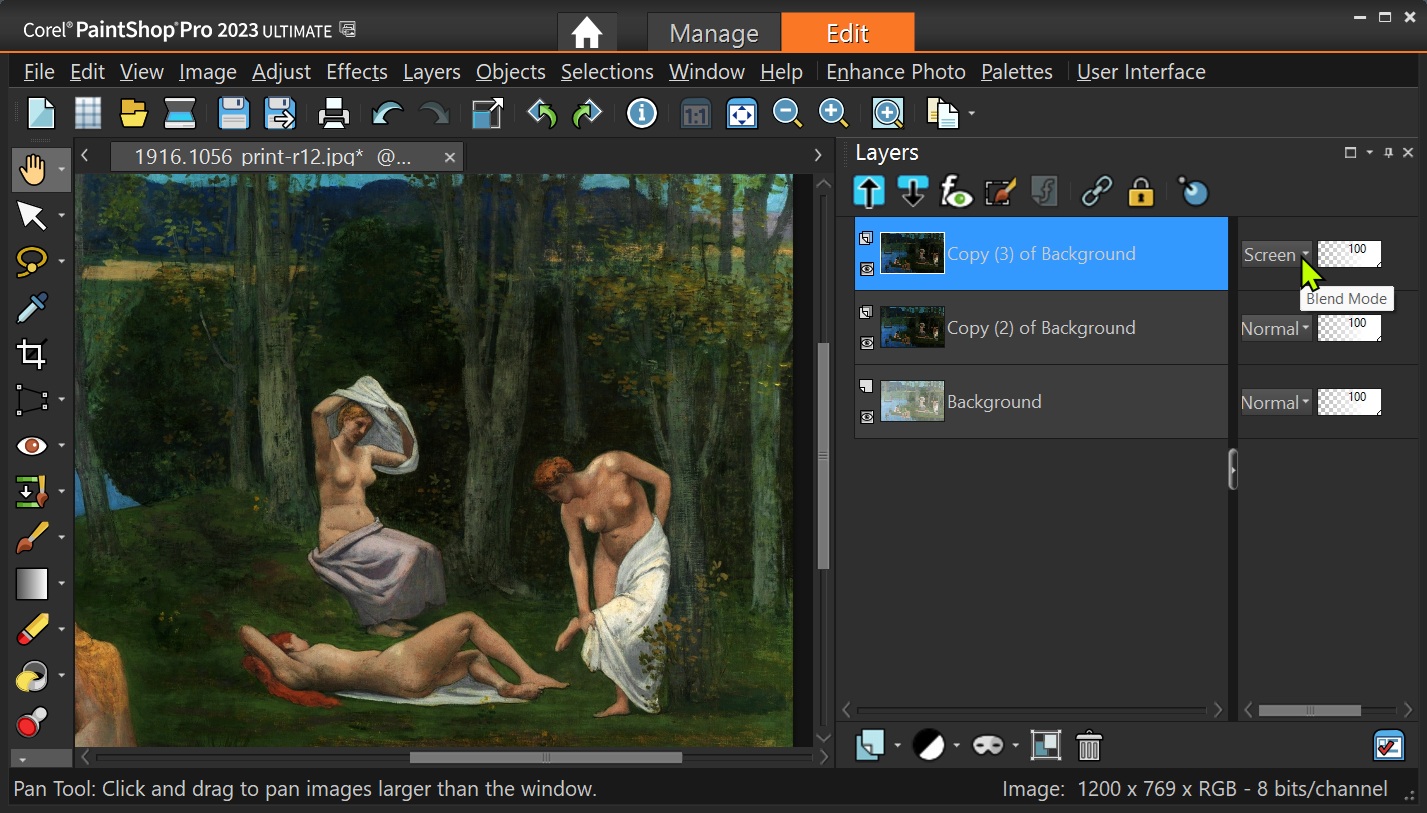
The result is dark. Another duplication and then using the blend mode “Screen” gives us a very nice, acceptable image. Screen adds the two layers together, again without burning out any highlights or making any shadow areas totally black.

See – just a few clicks and we went from a nearly worthless image to a fine one.
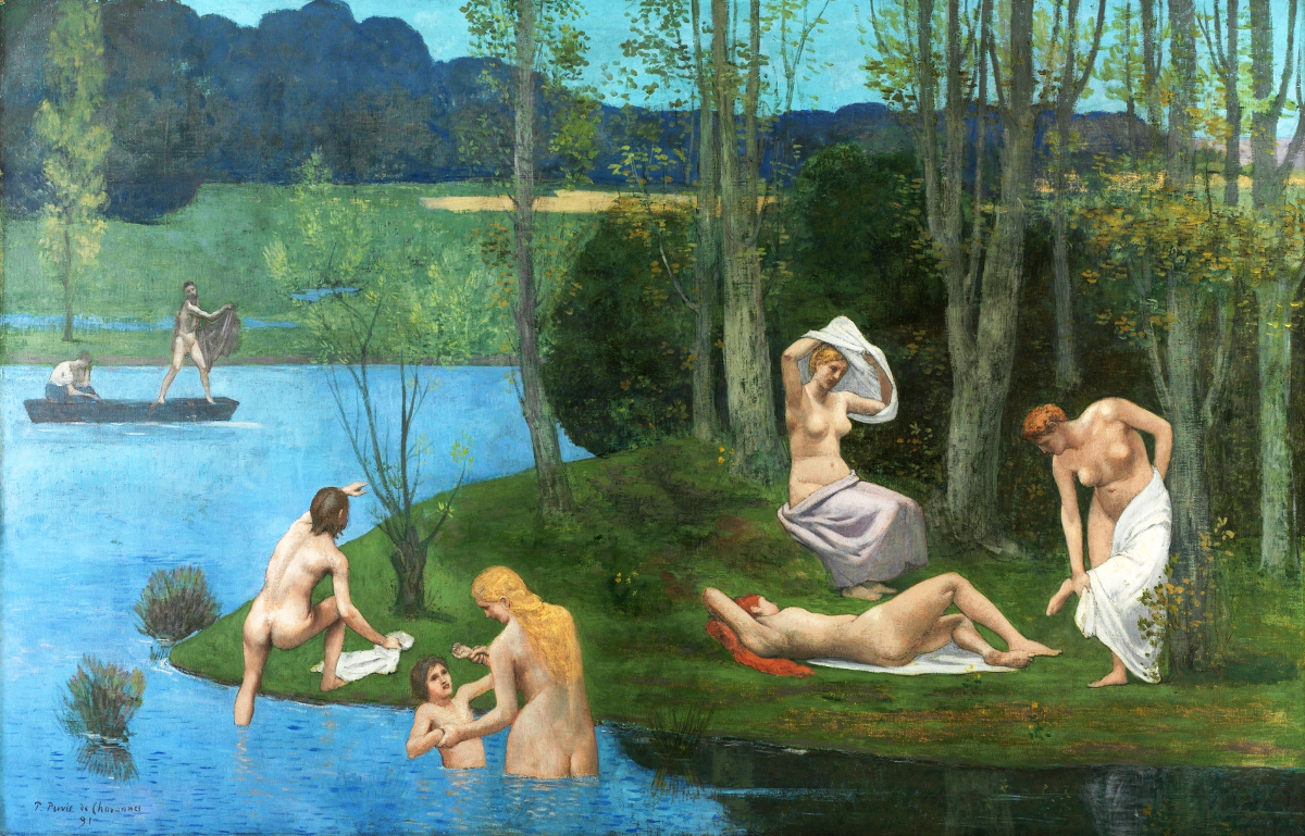
Summer – 1891 -Pierre Puvis de Chavannes – (French, 1824–1898)

Now we have that painting looking more like what it was like when the painter was finished with it.

Blend modes are very useful and can give interesting effects. Play with them, you will have fun and find good uses.

.:. © 2026 Ludwig Keck

How do I pep up a photo

Sometimes a photo turns out to look rather flat, without any “pep”. There can be many reasons for that, flat lighting is one. But let’s concentrate on how to enhance such a photo.

The first consideration should be to increase the contrast.

Here is an example:

Every post-processing editor has a contrast slider.

Here, in the image above, you can see how the contrast slider has pepped up the photo.

Another thing to watch for is a limited range in the histogram. If you see some “unused” space at either end of the histogram data, move the histogram sliders to where the histogram data starts.

The example here shows that the histogram data does not reach all the way to the left end. That means the photo does not have any intense blacks. Moving the left (blacks) histogram slider to the right until it gets to where the graph shows some values can make the image significantly better.

Here is an example of a photo that has a limited range showing in the histogram. There is no data on almost half of the right end – the photo is significantly underexposed.

Now here is the same image with both histogram sliders moved to spread out the available data over the range of brightness levels.

See how even poor photos can be rescued and result in photos that you can show and share.

.:. © 2026 Ludwig Keck

How do I add a distinctive signature to my digital images?

There are many ways to add your signature in a unique and distinctive way. Here is my approach. My tools are Microsoft Paint and Corel PaintShop Pro 2023. Your tools may be somewhat different in the details of how to do the tasks.

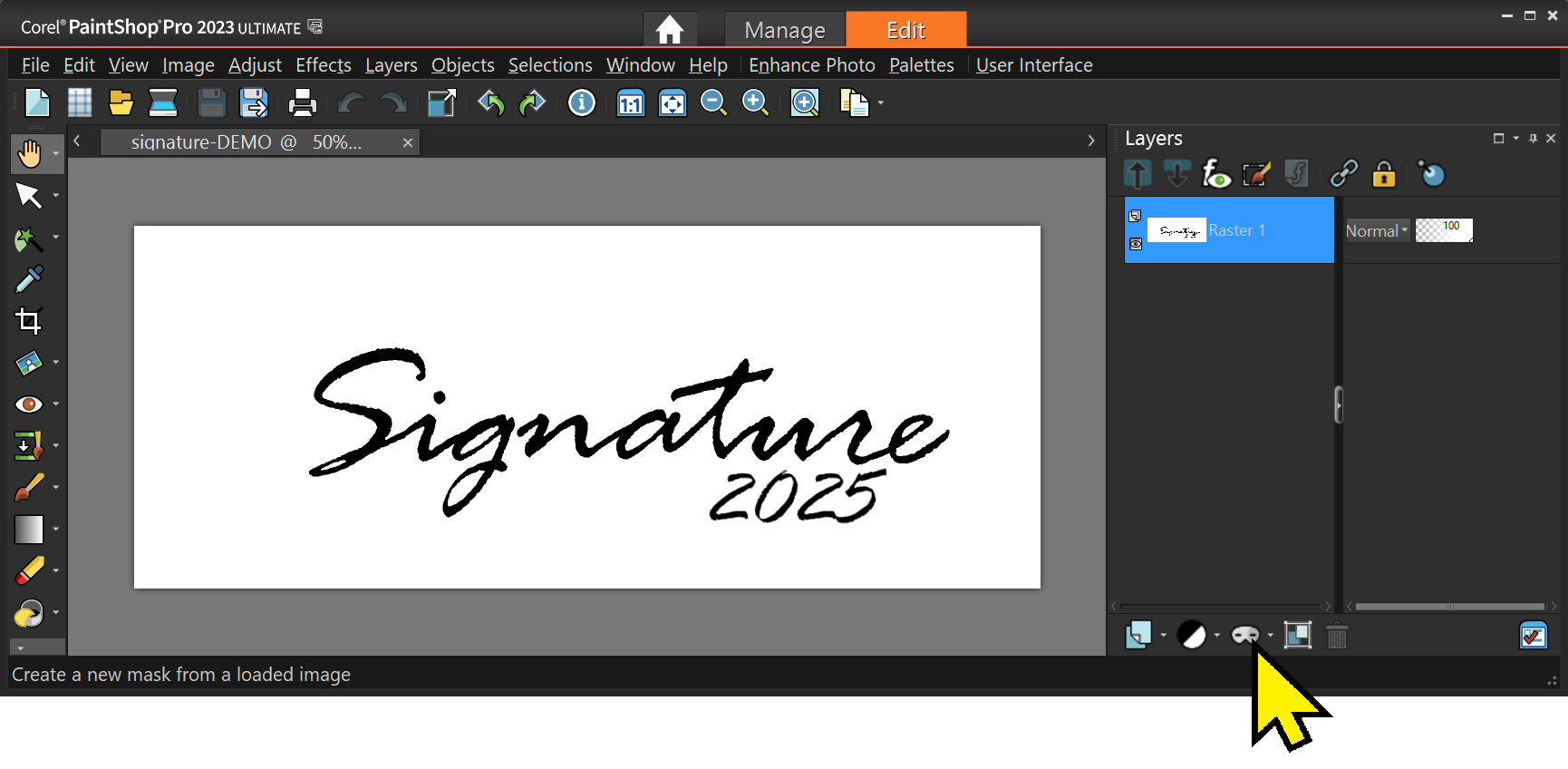
First create your signature. You can do it on paper and scan it, or photograph it, or use a tool such as Paint with its large variety of available fonts. Set the image size about 2000 pixels wide by 800 pixels high. Use heavy black lines to form your signature. Save it as a PNG file. Here is an example:

Next modify the signature image to make the white and colored parts, such as guidelines, transparent. One quick way is to use Paintshop Pro or similar tool. Load in your image then make a mask. Click the Mask tool icon and select “From Image …”.

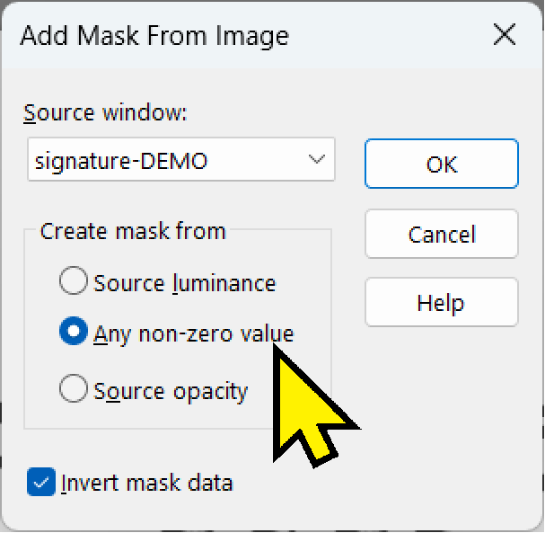
Next select “Any non-zero value”. That masks anything that is not totally black. Colored guidelines and gray areas will thus become transparent. That is what you want.

Then save the image as a PNG file to retain the transparent areas.

Open the signature image up and color it as you like. I make mine gray. This will allow “embossing” of the signature on your art. You may wish to touch up the final image to make it “perfectly yours”.

You are now ready to sign your work of art. Load it into PaintShop Pro (or your tool of choice, keep in mind that the details may be slightly different in another tool).

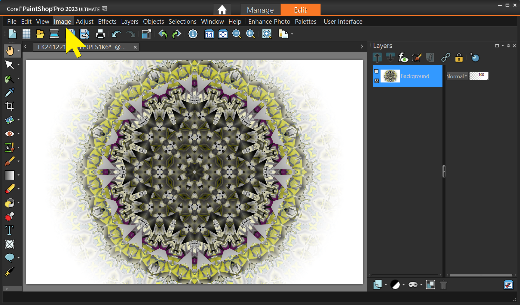
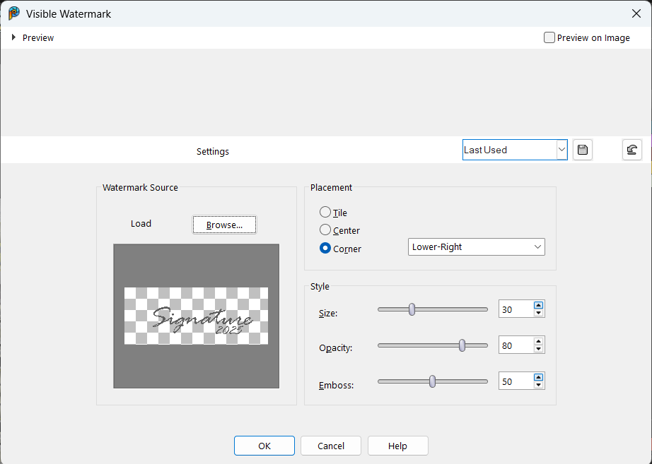
Select Image – Watermarking – Visible Watermark … – Then in the popup window browse to your signature file and then select the position, size, opacity, and embossing. Play with the levels until you get it exactly your way.

That’s it. PSP will remember your settings so next time it will be quick and easy.

.:. © 2024 Ludwig Keck

How do I manage the layout of text and images in my WordPress posts and pages?

The WordPress world has seen a lot of changes in the past few years, and everything seems new and different. The way the editors work in WordPress has been improved the most. Now everything is done with “blocks”. There are a large number of such blocks. For text with images many options exist. Using the Text and Image blocks is described in more detail here: CloudLadder – Layout with Text and Images.

That article helps you with the basics and allows showing images withing text pretty much as you see in magazines – and other sites. There are many more options and the CloudLadder site has (or will have) additional information.

.:. © 2024 Ludwig Keck